Reinventing the Wheel
Making it ridiculously easy to set objectives, and empower individuals, teams and organizations to successfully achieve them using 7Geese.
ORGANIZATION
7Geese
RELEASE
October 2020
SKILLS
User Research
Design Workshop
UX and UI Design

How do you redesign what already works?
7Geese began as a goal-setting product, attracting a majority of our customers for its OKR feature and the team’s expertise in the field. We serve a diverse range of companies so any changes must be carefully evaluated and implemented. As the feature grew to support market demand, the goal setting process became much more complex.
Make it Easy to Create Effective OKRs
Goal setting is a sophisticated process, not to mention how complex the OKR methodology is to begin with. The simplicity of the old creator does not facilitate a supportive process of creating objectives. And with the rise of other OKR products, we needed to maintain our competitive advantage.

The Old Objective Creator popped up after the user clicked on a button on the homepage
In the Old Objectives Creator, we assume two things:
The user is familiar with the method
They already know what their objectives are
These are far from reality. It became apparent once I started reviewing user feedback:
“The process for creating OKRs is not intuitive.”
“I don’t find it particularly easy to pin down measurable objectives.”
“…inserting the objectives are not really clear.”
Understand the Problem Space
I’m not an OKR expert so the first step was to read Measure What Matters by John Doerr and Radical Focus by Christina Wodtke. Those two books are regarded as the manual for creating effective OKRs successfully.
We categorize our users to three different types. Given the top-down and bottom-up approach of OKR, each archetype has a specific role in the process.
I then worked with the team to identify different paths our primary user types take when creating their objectives. After mapping their journey in 7Geese, I gathered user data from Pendo to create a baseline for measuring the impact of our success.
OKR follows a seasonal trend. Ideally, each objective should be closed and a new one created every start of a new business cycle. There are objectives that cycle every year and quarterly ones that are based on those annual objectives. Measuring impact of the new creator depends on when we launch this feature and which cycle it falls on for our customers. Some cycles don’t even follow the calendar year.
Trust the Process

In one afternoon, we were able to generate over sixty ideas thanks to the Crazy 8s sketch method.
The ideation phase kicked off with a design workshop. I first presented the findings to my team and our stakeholders and then facilitated a four-step sketch exercise to generate as many ideas as we could. At the end of the session, we selected five concepts from over sixty unique ideas. These concepts capture a wide variety of user mental models when creating objectives.

Concept 1: A self-guided form that is intended for educating users while they’re creating their objectives.

Concept 2: A timeline view of objectives that emphasizes progression in a given time period.

Concept 3: A note taking approach to facilitate clear thinking when writing objectives.

Concept 4: A step by step guide to creating objectives and identifying key results.

Concept 5: A view that emphasizes relationships between objectives and highlights their progress.
I crafted a narrative around these concepts and recruited users for testing. The participants were asked to provide a rating relative to ease of use and rank based on preference. Rating and ranking gave a quantitative measurement while qualitative feedback provided context.
The form concept resonated the most with our participants while the wizard pop-up format was a resounding nice-to-have. These concepts seem counterintuitive to the goal of making the process simple and easy, however, creating OKRs is a sophisticated process by default. The solution is to provide education and guidance for the users so they can adapt easily. The form and wizard pop-up have more real estate, which mean they can facilitate more user engagement. I went back to the team and presented the findings from the concept study and my design recommendations based on those insights.

The wizard pop-up, form and notes concepts were rated the highest.

The wizard pop-up and form concepts continued to rank high among the participants.
Reality Check
I also took this opportunity to discuss technical feasibility. The engineers’ input was included from the very start but as this enhancement became more concrete, it was time for a gut check. We ended up with the form concept as this was the most viable and feasible direction. The idea was to make it modular so that it can allow for educational content to be layered on later.
With that direction, it’s now time to polish the concept and look at usability in more detail. The key is finding the right combination of information architecture and visual layout. I needed to run usability testing not only to validate design assumptions but also discover what other mental models are there when it comes to creating an objective.
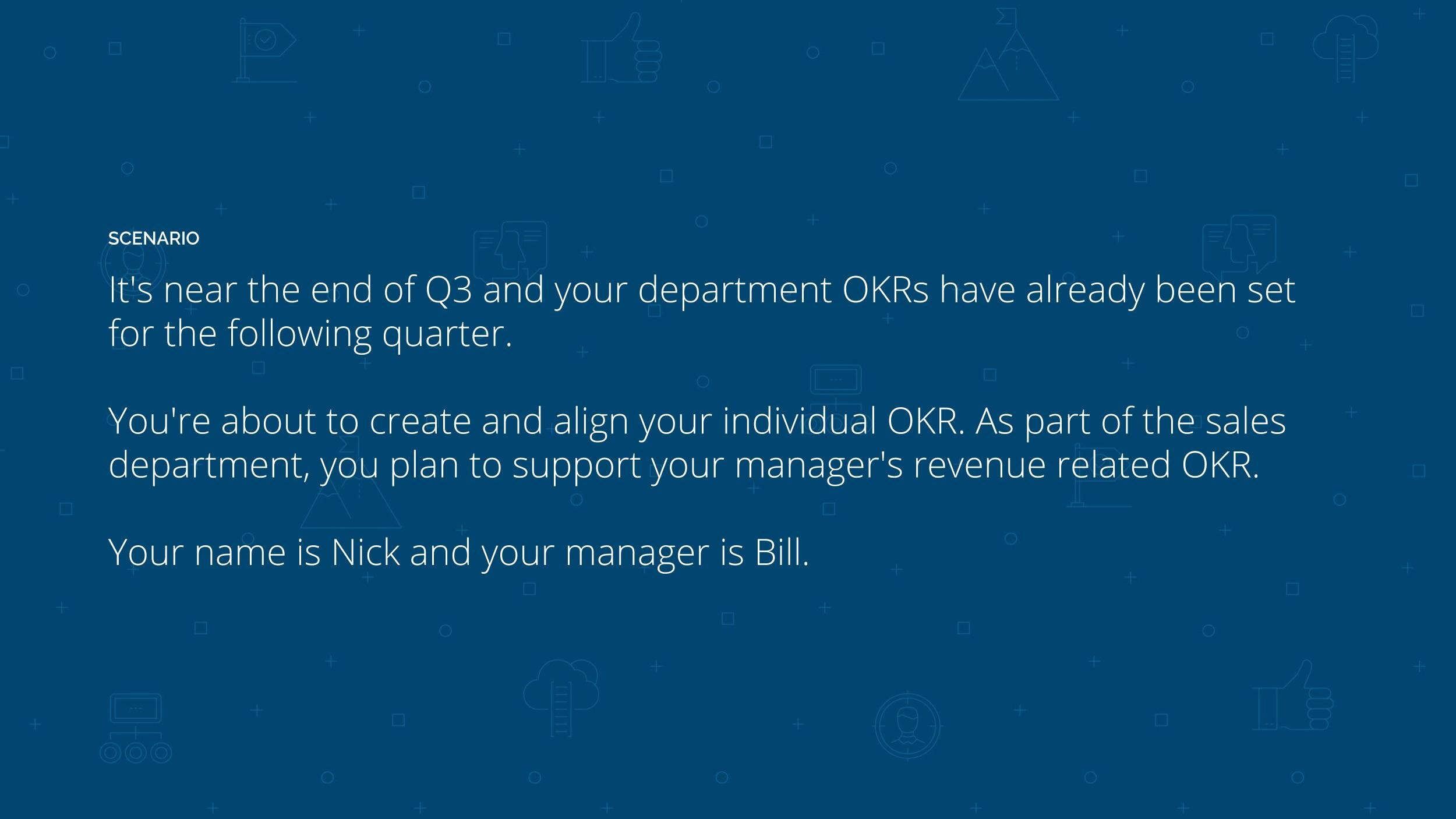
A scenario creates a good narrative for usability testing.
I recruited nine participants and facilitated the usability study. The form concept gathered an average System Usability Scale (SUS) score of 80 out of 100. It received positive feedback with the top response being that it’s simpler and more intuitive than the old creator. It was also quite interesting to see the differences in how our customers approach goal setting. It just goes to show that there’s not a single path to creating objectives.
Development kicked off with a technical review of the solution before bringing it to our sprint cycle. Prior to releasing the new objective creator to our customers, we ran a beta program to ensure we get more feedback:
“Easy to use, intuitive, links OKRs nicely”
“Perfectly fits our needs! We are just starting to use OKRs and the tool is easy to use and the right fit for busy people.”
“Useful interface! I can see other OKRs while creating mine”
The new way of creating objectives. Each card represents the crucial components when creating an OKR.
Since the release of the New Creator, we’ve increased the number of aligned objectives from 0.02% to 17%. That’s a whopping 85,000% increase in objectives alignment.
Final Thoughts
Alignment of objectives is the key to success for every goal. It also ensures product stickiness. Overall, it was an amazing journey coming from understanding the subject and problem space to releasing an effective solution. User validation played a key role in defining the most viable direction. And most importantly, it was teamwork that made this design vision into reality.